
While it’s true that we don’t get a second chance to make a first impression, cruise lines are doing just that; relaunching websites that have been online for years. Once a place to check itineraries, ships and pricing, cruise line websites have added rich video libraries, recipes, message boards and more. But the designers of some cruise line web sites have done a better job than others. Next generation cruise line websites are fun not only to browse and find specific information we are looking for. They go beyond simply presenting a big load of information efficiently, taking us on a journey much like the feel of a cruise itself.
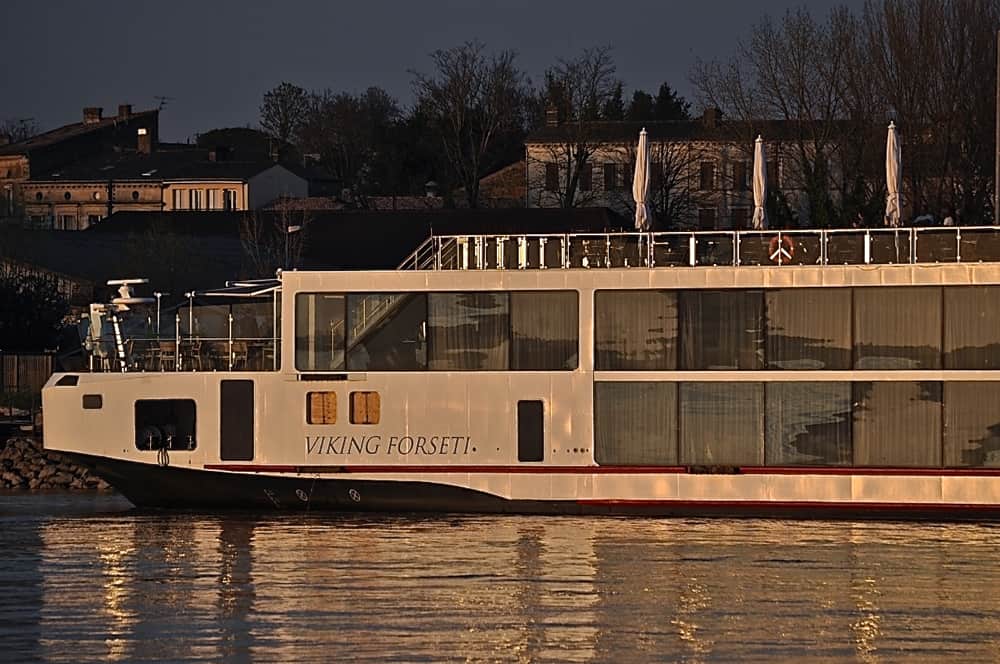
Viking River Cruises
Perhaps more charged with getting it right as Viking prepares to blow away the world of ocean cruising, Viking River Cruises tops our list. Recipes often posted here are easy to find as are reviews, video featuring Viking’s Karine Hagan are fun to watch and match our experience on Viking ships. Unless they figure out how to add ‘scratch and sniff” photos of their unique cuisine, we think this one has it all.
As we sail Viking River Cruises, we find zero disparity between the experience shown in video and what we actually see and do. That’s significant when video from other lines paints the picture of an unattainable experience bar set a bit too high for most travelers.

Carnival Cruise Lines
The world’s most popular cruise line did not get to be in that position by accident. Keeping it simple, Carnival.com positions most often needed information right up front and easy to find. On landing, site visitors choose from tabs that include first-timer info (Cruising 101), last-minute bargains (Save Up To 55%) and a spotlight on what’s new at the Funship Line (Camp Ocean).
Unique to Carnival.com, visitors must interact with the web site to continue. Clicking on Cruising101, brings questions (Traveling with kids?) which must be answered to continue, focusing the online experience to match the person on the other side of the screen.
Royal Caribbean International
The home of ‘wow’ has done some serious changing of what consumers see, bringing easy navigation, pretty new graphics and a better way to find information. That’s no easy task for any cruise line. In Royal Caribbean’s case there is so much going on all the time that it would be easy for any one initiative to be overlooked. Their newly redesigned site assumes common questions, providing answers right up front with tabbed sections that make finding information easy.
In near silence and without fanfare, Royal Caribbean has produced new shore excursion video that seems to go out of its way to nail the experience. Their Onboard Experience section alone is worth the few clicks needed to see what the line is all about.
The Future Embraces The Past
Also new to these and other cruise line web sites, full width view allows more, bigger photos, video, interactive experiences and more. Once a focus that hoped to replace expensive printed brochures some day, cruise line websites have had that ability for a while now. Yet still cruise lines print brochures for their fans to peruse at their leisure.
A fair argument could be made for getting rid of brochures. If for no other reason; web sites do it better. Still, there is something to be said for having travel brochures hanging around the house to get would-be travelers in the right state of mind. On the other hand, media included on the cruise line web sites noted here and others seems to jump off the pages as we click from one to another. That’s a journey that even the newest ships can’t take us on… until we are on board.